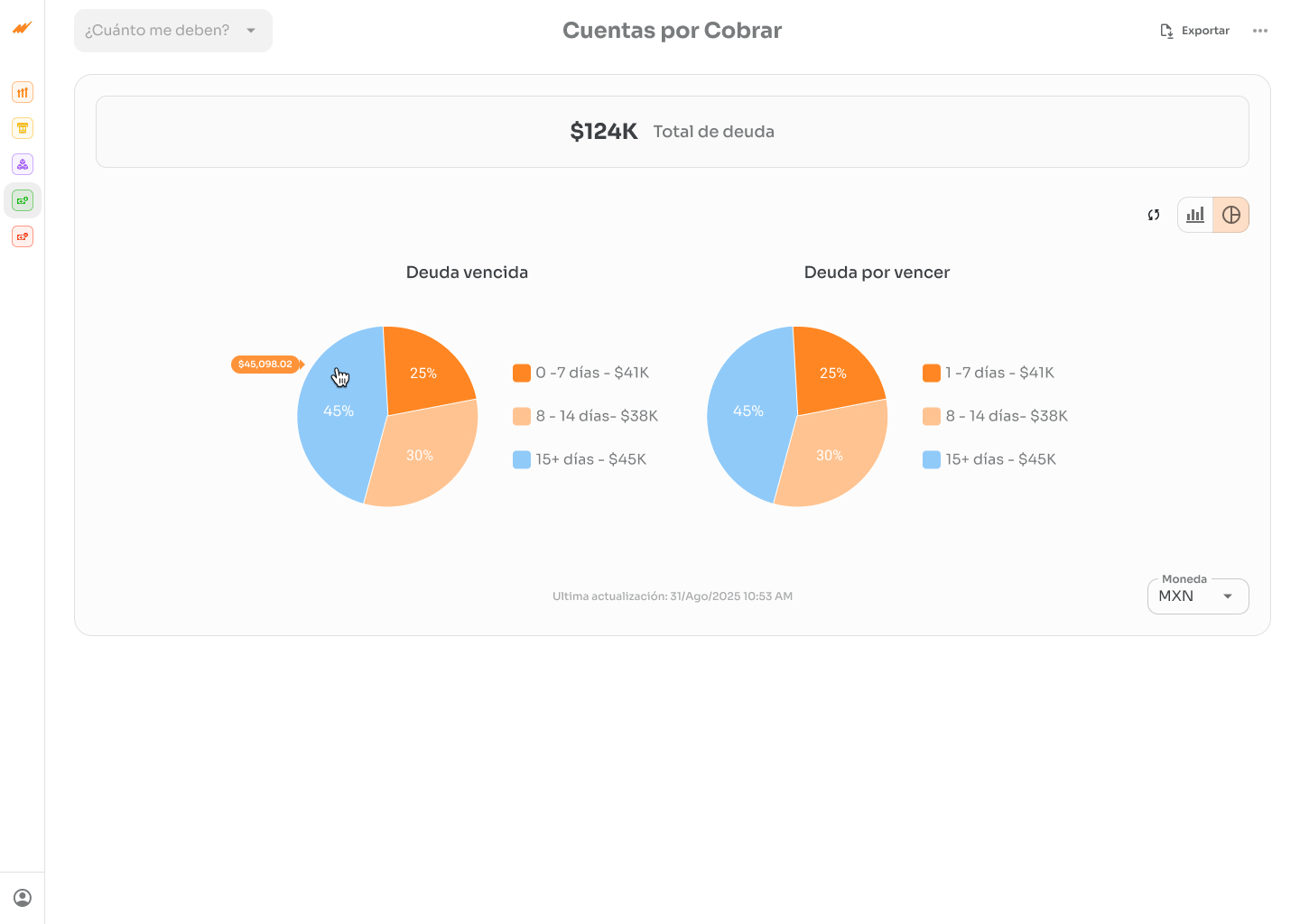
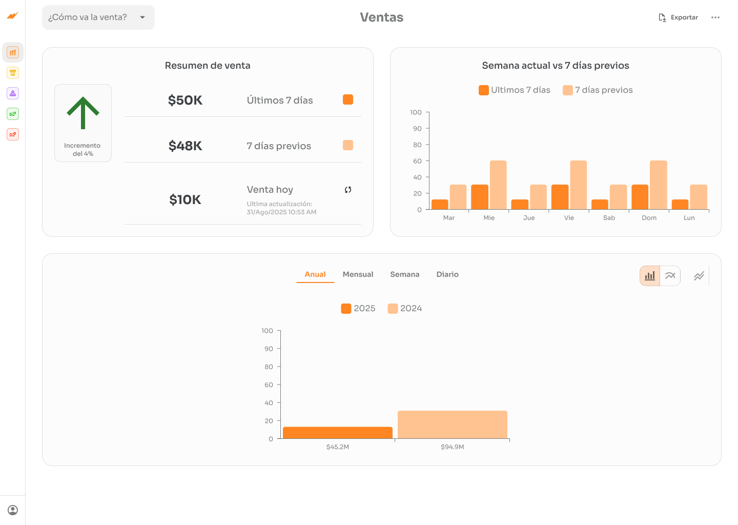
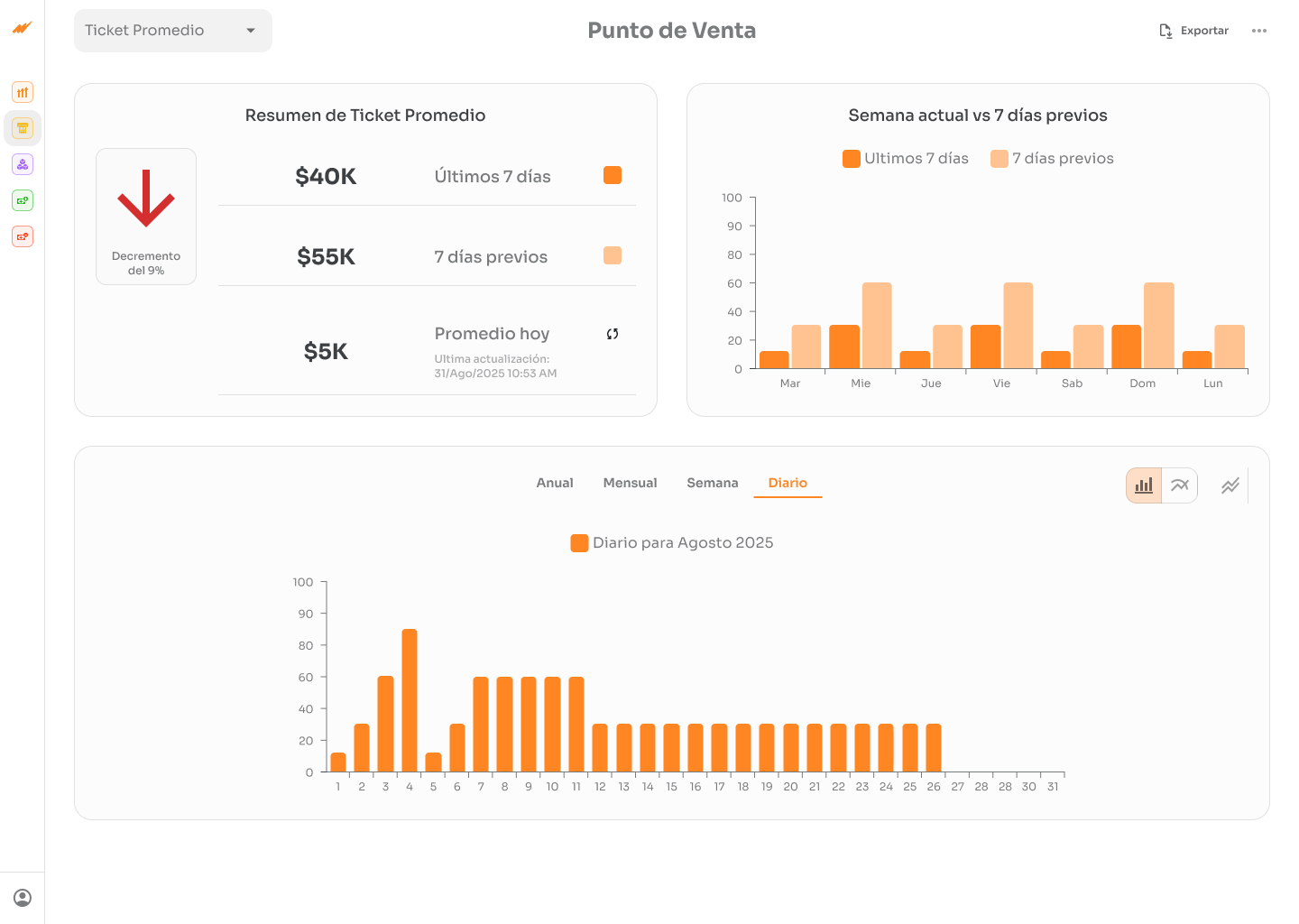
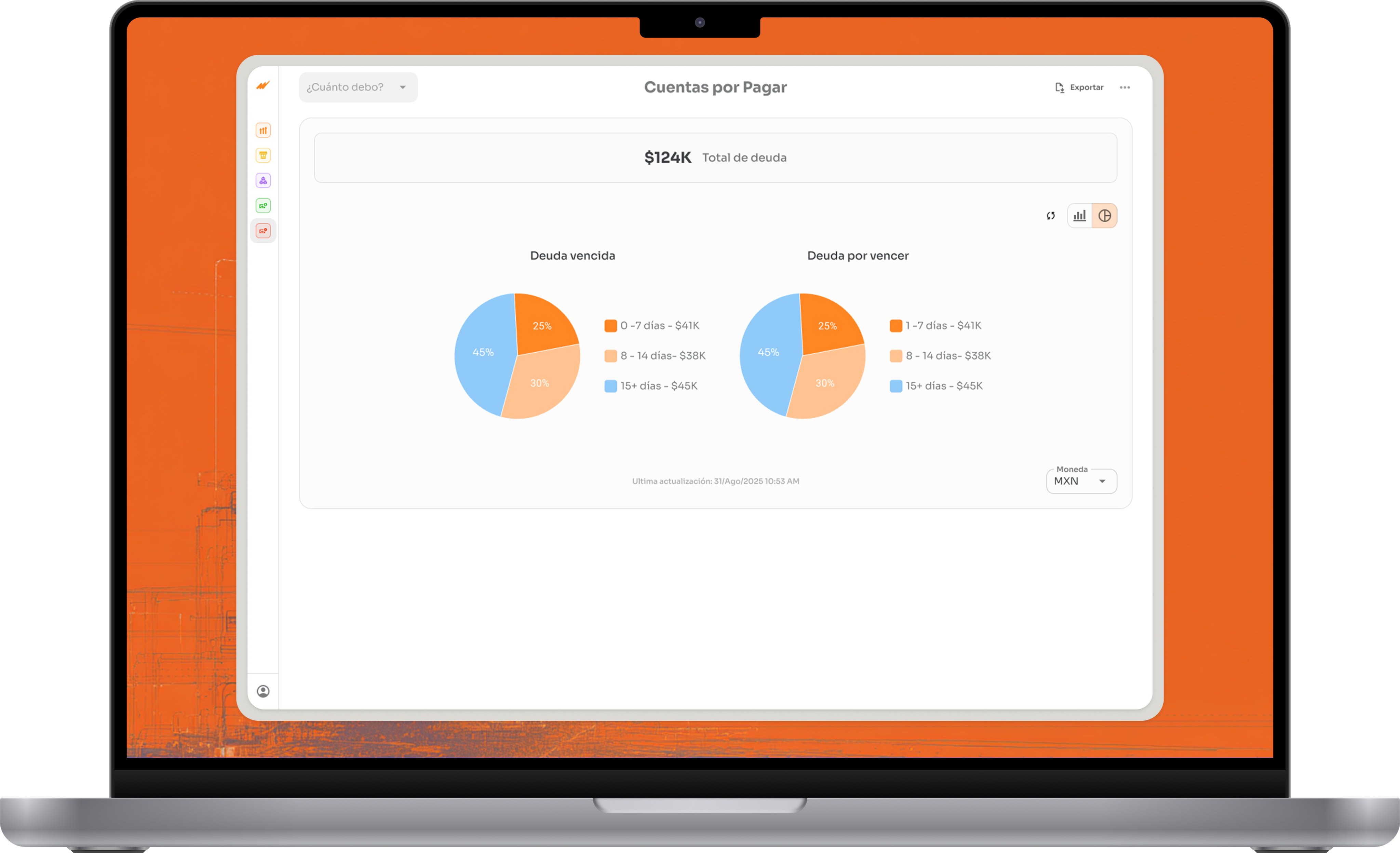
I designed a key performance indicator dashboard for SMEs, consolidating fragmented information into 7 visual metrics. Users now get answers in under 2 minutes instead of spending 15-20 minutes navigating multiple modules.


Problem
Context: SME owners in Mexico (Microsip) needed to monitor business health, but had to navigate 5+ separate modules.
Friction:
Research
Interview: A Mexican company's CPA confirmed the urgent need.
Insights:
Solution
1. Unified Dashboard: 5 modules → 1 screen with 7 KPIs
Visual answers to key questions:
Why: Research revealed 7 repeating questions. Solving for these 7 = maximum impact.
2. Visual Hierarchy: Important = BIG.
Why: 3 seconds = decision made. The eye goes where it's biggest.
3. Smart debt breakdown
Who owes me? $150,000
├─ OVERDUE: $20,000 [RED - Act now]
├─ UPCOMING: $130,000 [GRAY - Monitor]
Why: Enables prioritization. "Focus on the $20K overdue" vs. paralysis.
4. Historical comparisons on every card
Current period + "vs. last week: +15%" + mini-chart.
Why: Context = direction. The difference between insight and confusion.
Validation
Interview (Pre-design): Confirmed the 7 critical indicators + need for comparisons.
Testing wireframes (3 SME users): Participants completed key tasks (navigate to specific metrics, interpret comparisons, expand breakdowns) frictionlessly. Unanimous feedback: clear interface and intuitive visual hierarchy. None required additional instructions to understand the flow.
Metric:
Response Time
CHANGE:
90%
Before
15-20 min
After
<2 min
Less is more. 7 KPIs = greater adoption than 50 options
Historical context > solo numbers
Disclosed transforms paralysis into prioritization
Progressive disclosure > everything visible
✓ User Research
✓ Information Architecture
✓ Design Thinking
✓ Wireframing & Prototyping (Figma)
✓ Data Visualization
✓ User Testing
✓ Design Systems
This project reinforced that great UX isn't about adding features — it's about ruthless prioritization. Every design decision was driven by a real user need surfaced in research.
The biggest win wasn't the interface itself, but proving that focusing on 7 well-designed KPIs could replace 5 modules and cut decision time by 90%. Simplicity, done right, is a competitive advantage.

Let's talk
Whether you have a project in mind or just want to
see if we're a good fit — I'm open.
ANTONIO I.
2026